
As an amateur graphic design enthusiast and doodler, I’ve been thinking about common symbols used by different atheist, humanist and secularist groups, what they communicate and why they are or aren’t successful.
The happy human

In 1965 the British Humanist Association ran an international competition, with a prize of five guineas, to design an easily recognisable, meaningful symbol for humanism. The winning design by Dennis Barrington became the ‘happy human’ whose history originally inspired this article.
The symbol is reminiscent of the da Vinci’s Vitruvian Man, which has been used to illustrate the Humanist Manifesto, showing the roots of humanism stretch back far to the renaissance and beyond. A human is a fitting emblem for a worldview which places human agency at its centre. And it is an ‘H’ which works well for the many translations which begin with the same letter.
While the initial and modern trademark are owned by Humanists UK, they have encouraged its adoption and hundreds of humanists organisations around the world have created their own variations of the design.
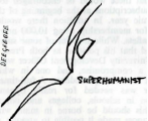
The happy human was originally known as the happy man, though along with the name change, revisions have lent towards a more inclusive agender version. Interestingly enough a superhuman flying design was apparently suggested in 1965. Happily, this with its sense of smug humanist superiority was rejected and so the happy human, unlike some of those on this list, provides a symbol in which we can see ourselves.
If you would like to learn more, I would recommend this write up in Humanist Life. Some years ago, Conway Hall had an exhibition dedicated to the symbol and it would be interesting to see something like that again.
The atheist A

My preferred type of this design is the atheist A spiral designed by Diane Reed for Atheist Alliance International (AAI), though the copyright for this was released by the artist and it is extremely widely used. It is probably the only atheist symbol which is as ubiquitous as the happy humanist. AAI currently use a more stylised capital A in the form of a triangle.
According to user PZ Meyers: “The circle represents the natural universe, the point is the inquiring mind, and the resemblance to the Latin ‘A’ is both a nod to the language of science, and to the necessity of having some easily graspable connection to ‘atheism’.”
It is also reminiscent of the at sign (@), which reflects the important role that online email and social media has played in the modern atheist movement.
Other notable versions of the atheist A include the scarlet script “A” in the Zapfino typeface. This was adopted by the Out Campaign launched by Robin Elisabeth Cornwell at the Richard Dawkins Foundation. The campaign aimed to reappropriate a symbol of stigmatism (more on that later) to encourage closeted atheists to proudly self-identify.
Scientific symbols

The atomic whirl may sound like a pop band invented by an artificial intelligence. It is actually the symbol of American Atheists. It was selected when the group was formed in 1963, a modern symbol of the atomic age. The use of the symbol associates atheism with science. In the American Atheist design the central orbital is open at one end: “This demonstrates that while atheists rely on the scientific method for learning about the cosmos and increasing our knowledge about nature, we know that not all of the answers are in.”
While the logo itself is copyrighted, the atomic symbol with its association with a scientific worldview and discovery is widely used by atheist groups and individuals, for example the International Association of Atheists.

Another scientific symbol that I see commonly used for AHS+ identification is the double helix. This associates atheists and other AHS+ groups with science and particularly the science of genetics and evolution, which is often attacked by religious reactionaries. In the logos for the Richard Dawkins Foundation for Reason and Science, and Centre for Inquiry, the double helix is presented like a flame, a torch of rationality lighting up a dark world. I also really like this design by artist Mel Biv. Other notable examples include the Openly Secular campaign which grew out of the Out Campaign referenced above.

The infinity symbol shows up in a lot of AHS+ logos. I think the best example is from Camp Quest, where the different loops are shaped into their initials, CQ. The symbol evokes the infinite possibilities of exploration in the real world, as well as the interconnectedness of community. In some designs it can be seen to subvert the Christian ichthys symbol.
Sometimes, as in the example above, DNA imagery is incorporated into the infinity symbol, likely symbolising the infinite possibilities within humanity.
The Leviathan Cross is also used as a symbol within atheistic or Satanist groups parodying Christianity, though not widely used in other AHS+ circles. The infinity symbol here indicates the infinite possibilities of nature while the double inverted cross symbolises protection and balance between people. Satanism, both as a satirical and metaphorical religion is more likely to appropriate religious symbols than other AHS+ groups. Doing so is itself an act of satirising Christian conspiracy theories about hidden heretics identified by secret marks.
Direct subversion of religious symbol

Darwin fish, the Flying Spaghetti Monster and variations on the crucifix are often used within AHS+ iconography to satirise or subvert religious ideas.

While popular within online AHS+ communities direct subversions of religious symbols are rarely adopted as the symbol of organised groups. Notable exceptions include Ex-Muslim groups, many of which appropriate the Crescent and Star or other Islamic symbols. A common design inverts the crescent (similar to an inverted cross in anti-Christian imagery) and replaces the star with the prefix “EX”. This very symbol is an act of defiance given strong Islamic taboos against blasphemy or innovation. Interestingly many Ex-Muslim groups also make use of green, a colour strongly associated with Islam, or red, its opposite.
I suspect that as denominational specific apostate groups grow in visibility, appropriation and subversion of more diverse religious symbols may be more a popular in their iconography.
Secularism

As far as I can see, there isn’t a symbol specifically associated with secularism. If you search for one you tend to get more examples of symbols associated with atheism and humanism. I wonder if this is related to secularism being a more complicated idea that is often misunderstood or seen as part of atheism, rather than its own separate ideology. Common approaches to illustrating secularism include equals signs, scales or balance between different religious symbols and occasionally a capital ‘S’. Of that last type, I particularly like how Pagans for Secularism have incorporated the capital ‘S’ and the pentagram.
Use of religious symbols, often a range of symbols together, or repetitions of symbols to indicate diversity, are more common within secularist groups which are more open to religion or associated with particular religious traditions. British Muslims for Secular Democracy also make use of a traditional Islamic symbol (the Rub el Hizb) in an interesting way. Because the organisation is not anti-religious and includes religious Muslim secularists, the symbol is not subversive. It is more complicated than a traditional Rub el Hizb indicating an open-mindedness to other perspectives, while its use of angles and colours is reminiscent of a union flag, indicating a comfort combining Islam with symbols of a largely secular country.
Perhaps when George Holyoake was inventing the word secularism he should have come up with some symbol to help identify it distinctly from atheism. Speaking of the nineteenth century secularist movement, I was surprised to learn that the pansy was once a widely recognised symbol of freethought. Charles Bradlaugh, founder of the National Secular Society, took the flower and its colours for his election campaigning from the late 1860’s. Pansy is derived from the French pensée, meaning thought or reflection, as is pensive. Interestingly, Pansy is first recorded being used as an insult much later, in 1929, with overtones of anti-intellectualism and homophobia. I wonder if this is related to its association with prominent freethinkers and secularists who were pacifists during WW1.
Others
The Brights, an atheistic social movement founded by Paul Geisert and Mynga Futrell, and definitely the topic of a future article, use an interesting symbol. The symbol represents a celestial body viewed from space, so can be placed in any direction. It is intended to bring in the ideas of scientific grandeur, the humbling power of nature and humanity’s place in the cosmos incorporated in other AHS+ symbols. But the imagery, like other aspects of The Brights’ ideas, is in my view both too self-aggrandising and confused in its relation to the people it aims to represent.

The green circle image used by the Atheist Republic #AtheistDay campaign and other online atheists, often associated with Ex-Muslims, is an interesting symbol which doesn’t fit neatly into any of these other categories. The circle could be seen to represent the natural world and all its possibilities or the Earth itself and the need for global solidarity. It is drawn in paint indicating the importance of artistic and creative expression in challenging religious fundamentalism. The circle indicating a zero or the natural world devoid of gods is itself a common atheistic symbol.
Triangles

Triangles are widely used within AHS+ imagery, because of their association with scientific rationalism and balance. It is also a dynamic shape which can be used to indicate direction. I really like how Sunday Assembly, a movement of secular congregations, use the triangle. Sunday Assembly seek to “reclaim the rituals, language, and symbolism long dominated by religious and political forces” so the triangle, also used in Christian iconography to represent the trinity, can be seen as representing their own secular trinity of principles: Live Better. Help Often. Wonder More, and the idea that these are in some sense different, but co-equal parts of the same idea. The arrangement of the letters in a “non-traditional and puzzling manner” also invites the viewer to delve deeper. The upside down triangle is also reminiscent of the location pin marker, indicating the presence of an assembly in physical space.

I had a lot of pretentious notes on the logo for the AHS+ blog. The three-sided triangle is designed to show that atheism, humanism and secularism can each serve as an equal foundation. The corners are rounded, to show that the divisions between these concepts are not always clear. The triangle is a bit like some variations of the atheist A, but also looks a little like a house – indicating that AHS+ space should be a home for people. The triangle can also be seen as an empty frame, where you can place yourself. In UK signage, triangles indicate warnings and at the AHS+ blog we are often warning about issues. The colour has deep symbolism, meaning that I like pink.

5 thoughts on “Happy humans and atheist ‘A’s; the symbolism of AHS+”